What Are the Three Most Beautiful Pins You've Seen in Person?
- Messages
- 722
- Location
- SF Bay Area, CA
1. What are the three most beautiful pins you have seen in person?
2. What makes each beautiful to you?
NOTE:
I’m asking about beautiful pins here, not favorite pins.
I’m asking about pins you’ve seen in person, not images of pins.
Here are my three:
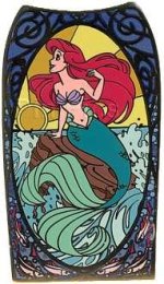
Pin 36939: Disney Auctions - Art Nouveau Jumbo Pin (Ariel)
The pin manages to be bold and graceful and finely detailed, all at once: the vibrant primary colors, the movement in Ariel’s hair and tail and body line that mimics the movement in the waves, the fine black lines that make the details stand out rather than get lost as details do in other pins, the large size. It's simply gorgeous.
----------
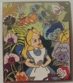
Pin 42382: Disney Auctions - Elisabete Gomes Signed Set (Alice with Flowers)
There’s something beautifully subtle and soft about the details and coloring of this pin. The fine detail of the flowers in non-primary colors gently frame Alice, and the lime-green background on the top half of the pin is particularly pleasing, allowing the details and softer colors of the upper flowers to stand out.
----------
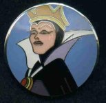
Pin 9455: Evil Queen - Brenda White Collection
This pin takes no prisoners: it’s clean, strong, and deceptively simple. The bold primary colors (vivid blue background, crisp white collar, and saturated gold crown) are emphasized by the high gloss of the glass cloisonne. The single image of Maleficent front and center, with no distracting details, is reinforced by the convex surface, so she seems to push out toward the viewer--aggressive, strong. The geometrically pure roundness of the pin is also beautiful to me.
2. What makes each beautiful to you?
NOTE:
I’m asking about beautiful pins here, not favorite pins.
I’m asking about pins you’ve seen in person, not images of pins.
- Beautiful, not favorite, because favorites may be based on sentimental attachment to a particular character, collection, or memory rather than beauty.
- In person, not online, because images can look either better or worse than the actual pin.
Here are my three:

Pin 36939: Disney Auctions - Art Nouveau Jumbo Pin (Ariel)
The pin manages to be bold and graceful and finely detailed, all at once: the vibrant primary colors, the movement in Ariel’s hair and tail and body line that mimics the movement in the waves, the fine black lines that make the details stand out rather than get lost as details do in other pins, the large size. It's simply gorgeous.
----------

Pin 42382: Disney Auctions - Elisabete Gomes Signed Set (Alice with Flowers)
There’s something beautifully subtle and soft about the details and coloring of this pin. The fine detail of the flowers in non-primary colors gently frame Alice, and the lime-green background on the top half of the pin is particularly pleasing, allowing the details and softer colors of the upper flowers to stand out.
----------

Pin 9455: Evil Queen - Brenda White Collection
This pin takes no prisoners: it’s clean, strong, and deceptively simple. The bold primary colors (vivid blue background, crisp white collar, and saturated gold crown) are emphasized by the high gloss of the glass cloisonne. The single image of Maleficent front and center, with no distracting details, is reinforced by the convex surface, so she seems to push out toward the viewer--aggressive, strong. The geometrically pure roundness of the pin is also beautiful to me.
Last edited:

