What do you think?

-
Guest, Help The DPF Community Thrive - Join Our Donation Drive Today!
We're launching a special DPF Donation Drive to ensure our beloved forum continues to flourish. Your support is vital in helping us cover essential server costs and keep our community running smoothly — This is more than just a donation; it's an investment in the future of our community.
Join us in this crucial drive and let's ensure our forum remains a vibrant and dynamic place for everyone.
Please visit the DPF Donation Drive Thread for details and instructions on how you can make your donation today!
You are using an out of date browser. It may not display this or other websites correctly.
You should upgrade or use an alternative browser.
You should upgrade or use an alternative browser.
What do you think?
- Thread starter swim2sea
- Start date
- Status
- Not open for further replies.
More options
Who Replied?
What do you think?


- Messages
- 1,365
- Location
- Chicagoland
Awesome idea!!! They look so cool!
The only think I'd probably do differently is get rid of the phrase in the middle, but that is just a personal preference. I think it takes away from the characters and isn't really necessary.
The only think I'd probably do differently is get rid of the phrase in the middle, but that is just a personal preference. I think it takes away from the characters and isn't really necessary.

- Messages
- 3,208
- Location
- Cork, Ireland
awesome idea ")
- Messages
- 3
- Location
- Morgantown, WV
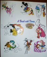
A suggestion from the critical eye who has yet to frame any of his pins:
1. The idea is flawless. Love, love, love the B&W with just a little colored in
2. The title is distracting. Maybe use waltograph font if you're sold on having it(message me if you would like that file/font). Leaving it out may be an option too.
3. The left side, above and below Lilo and Stitch, looks a little empty(especially if you eliminate the title). Would enlarging the stitch pic look ok, or would it look too big compared to the others?
4. If you take out the title, consider highlighting the palette pin. Ideas include, an all B&W easel or one with a "splash" of color, and this could be in the same size as the other characters and centered, or a giant easel with the palette pin in the corner and all the characters on the canvas.
When I reread this post I seem very critical, but in all honesty I think this is one of the most original and creative frames I've seen. keep up the good work.
Joey!
caligirlUCR
Active DPF Member
- Messages
- 2,653
- Location
- Huntington Beach, Ca
That is BEAUTIFUL!!!!
A suggestion from the critical eye who has yet to frame any of his pins:
1. The idea is flawless. Love, love, love the B&W with just a little colored in
2. The title is distracting. Maybe use waltograph font if you're sold on having it(message me if you would like that file/font). Leaving it out may be an option too.
3. The left side, above and below Lilo and Stitch, looks a little empty(especially if you eliminate the title). Would enlarging the stitch pic look ok, or would it look too big compared to the others?
4. If you take out the title, consider highlighting the palette pin. Ideas include, an all B&W easel or one with a "splash" of color, and this could be in the same size as the other characters and centered, or a giant easel with the palette pin in the corner and all the characters on the canvas.
When I reread this post I seem very critical, but in all honesty I think this is one of the most original and creative frames I've seen. keep up the good work.
Joey!
Thank you so much for the comments. I'm trying to find today and easel that will fit in the center. I'm undecided if I should "frame out" each picture with the mat which would provide more "equality" or just leave it alone. I'm using a white background with a black mat on top. I'm going to use small borders to avoid the black overtaking the picture. The title words are GONE!!! I thought they looked bad but needed to hear it too. I'll post the finished product when I get it matted and framed.
I'm going to try to photo and post some of my other frames this week so keep checking. Thank you all for the kind words, ideas are sometimes hard to come by. And yes, I will gladly share any of my backgrounds. I have hundreds. The hardest part of this project was matching the colors. I used the colors on the end of the brush, but any color in the brush would work. I wish I was an artist, but I'm not, but I can use my computer fairly well. I have another sketch series that I'm working on and hope to have it done soon.
- Messages
- 721
- Location
- SF Bay Area, CA
I'm undecided if I should "frame out" each picture with the mat which would provide more "equality" or just leave it alone.
That sounds like it might be a nice additional touch.
- Messages
- 2,920
- Location
- Billings MT
This is amazing. Wow. Wow. Wow! You ARE artistic. When I grow up, I hope I can come up with something 1/2 as awesome to frame my pins!!!
This is amazing. Wow. Wow. Wow! You ARE artistic. When I grow up, I hope I can come up with something 1/2 as awesome to frame my pins!!!
Annette, the only reason I can come up with ideas is that that I decided a LONG time ago to never grow up
I always say you can't stop growing old, but you never have to grow up. Kinda goes with the Disney thing I think (LOL).- Messages
- 4,358
- Location
- Southern Illinois
Other than everyone else's #1 criticism (title) I like the idea. I think that one idea of what would have made it more authentic would be to place it directly on an art canvas rather than framing, though I can't think of a way to actually implement that.
leopardpolkadotspots
Active DPF Member
- Messages
- 2,621
- Location
- United Kingdom
Stunning!!
Oh, I just love it!!! I think your idea of matting them all separately would bring it to the next level (if that's the term -- like, framing them in matte separately instead of having the single sheet of paper with white space).
Thank you for sharing!
Thank you for sharing!
Other than everyone else's #1 criticism (title) I like the idea. I think that one idea of what would have made it more authentic would be to place it directly on an art canvas rather than framing, though I can't think of a way to actually implement that.
I tried that, but the canvas got hung in the printer and it took nearly an hour to get it free. SO........that's why the framing. I do have canvas looking paper that I'm printing the pictures on so it will sort of look like canvas.
- Status
- Not open for further replies.